PharmAppy
A few days → a few hours
Reduced average website turnaround time from one day to under two hours
3+ → 1
Consolidated 3+ separate tools into a single internal system, used daily by the full team
Concept → Ship
End-to-end ownership from concept to deployment — design, build, and ship without handoff
Overview
PharmAppy is a pharmacy technology platform operating in one of the most regulated and underserved corners of UK healthcare. I joined as the sole designer early on — no system, no consistency, and a product that needed clearer communication for pharmacists who'd seen every overpromising SaaS pitch. The work spanned a shared design system, public-facing product documentation, a customer onboarding experience, custom utilities I built where off-the-shelf tools fell short, and a 0→1 internal operations portal that consolidated the team's stack into one system.
Custom Tools
I also built small custom tools to generate motion and visual assets used inside the website build.
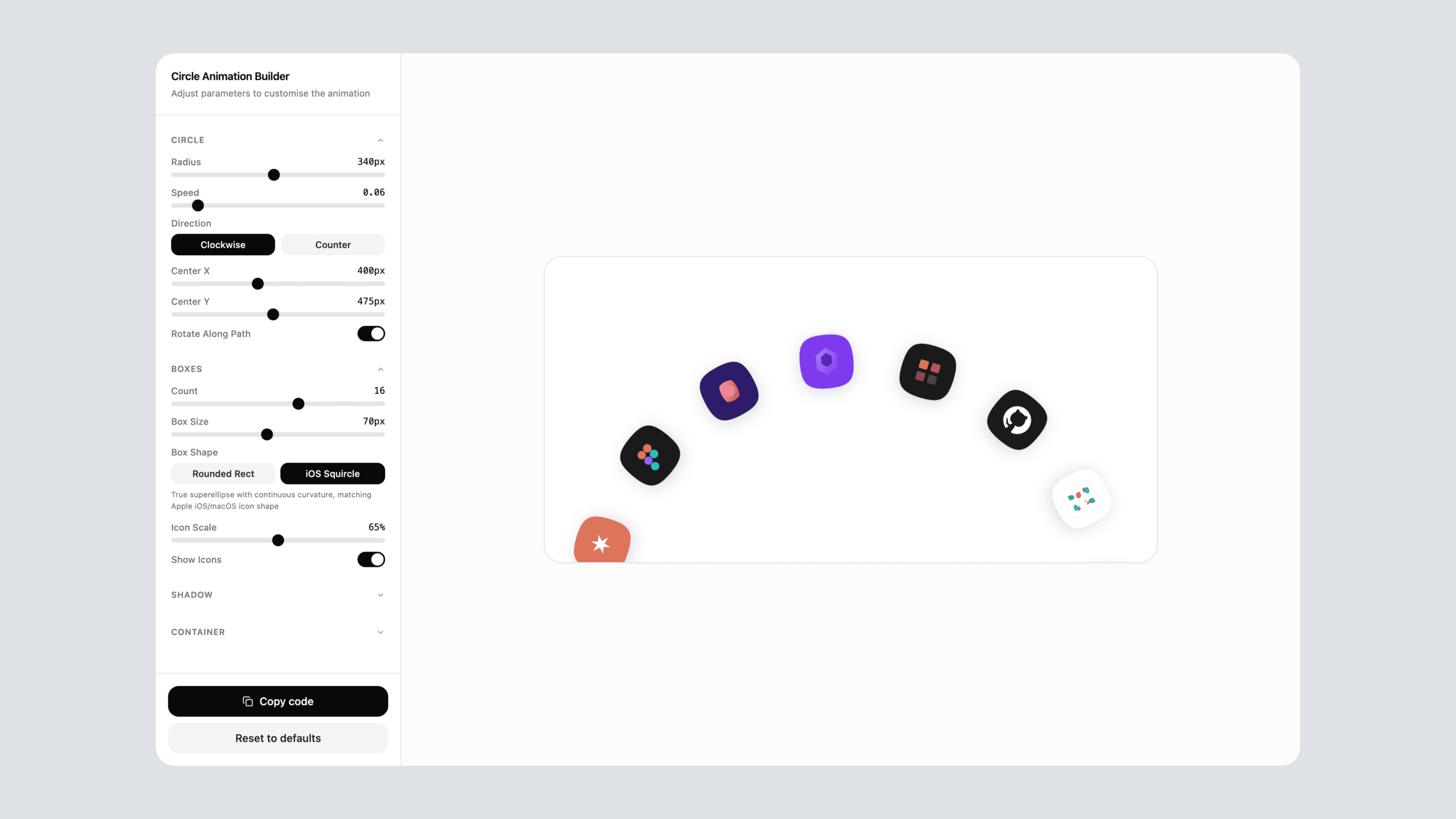
Circle Animation Builder
A parameter-driven animation builder for tuning orbital icon motion and exporting code-ready visuals for the PharmAppy website.
Open tool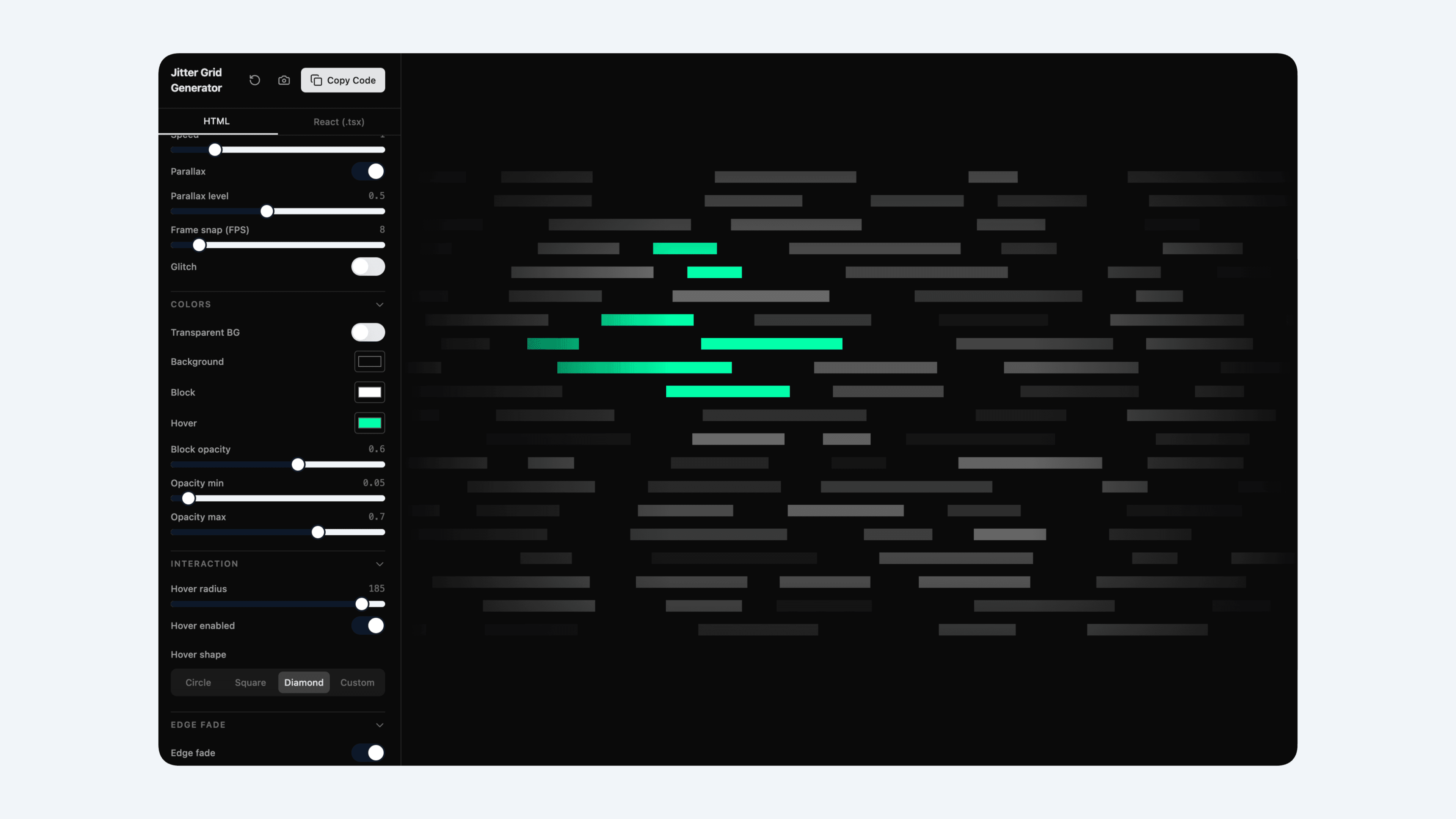
Jitter Grid Generator
A visual generator for creating shimmer and jitter grid treatments that could be copied into the site as reusable brand assets.
Open tool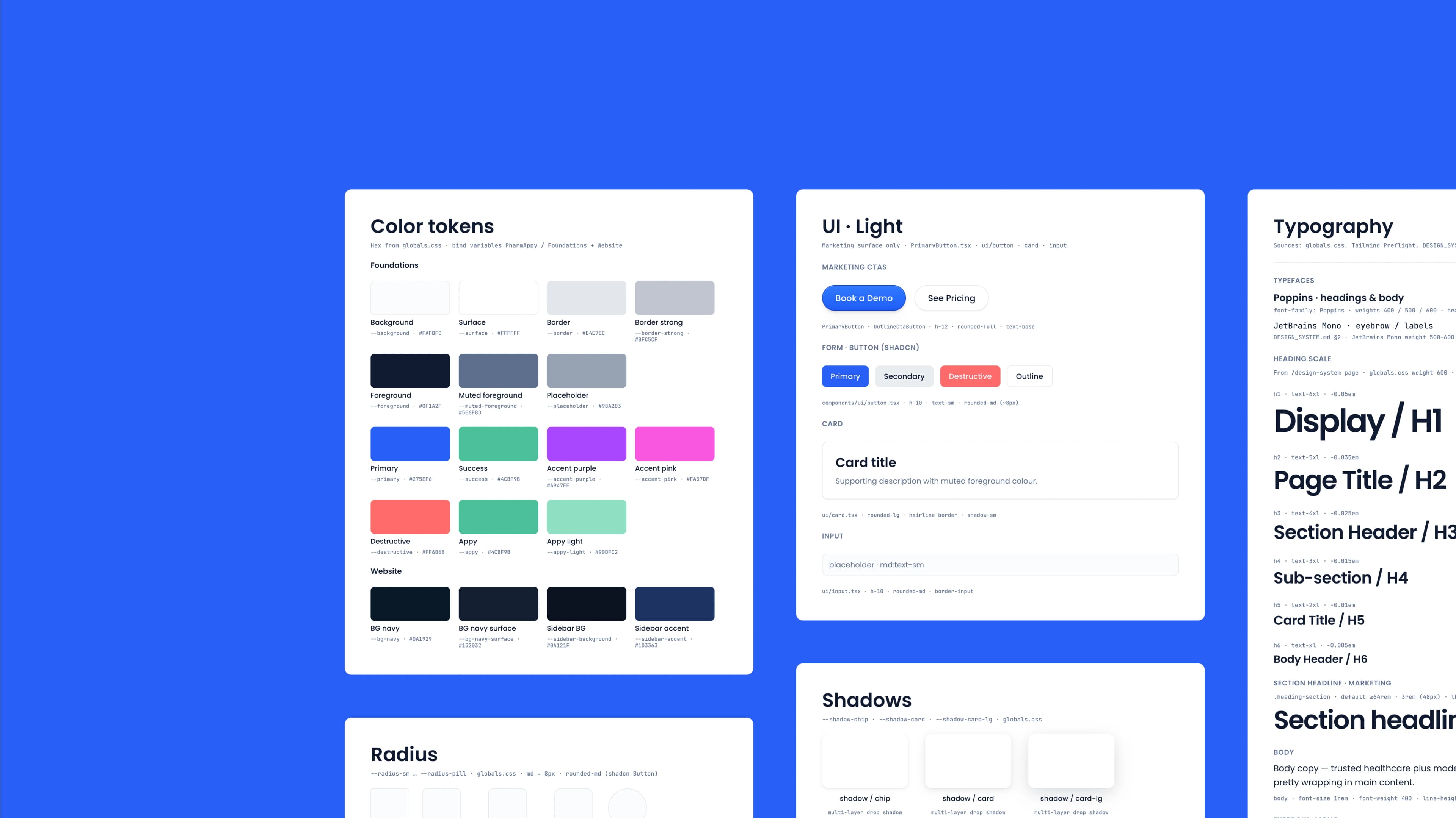
The design system was authored in code first — CSS variables, component specs, and token values written as the source of truth, not exported from a design tool.
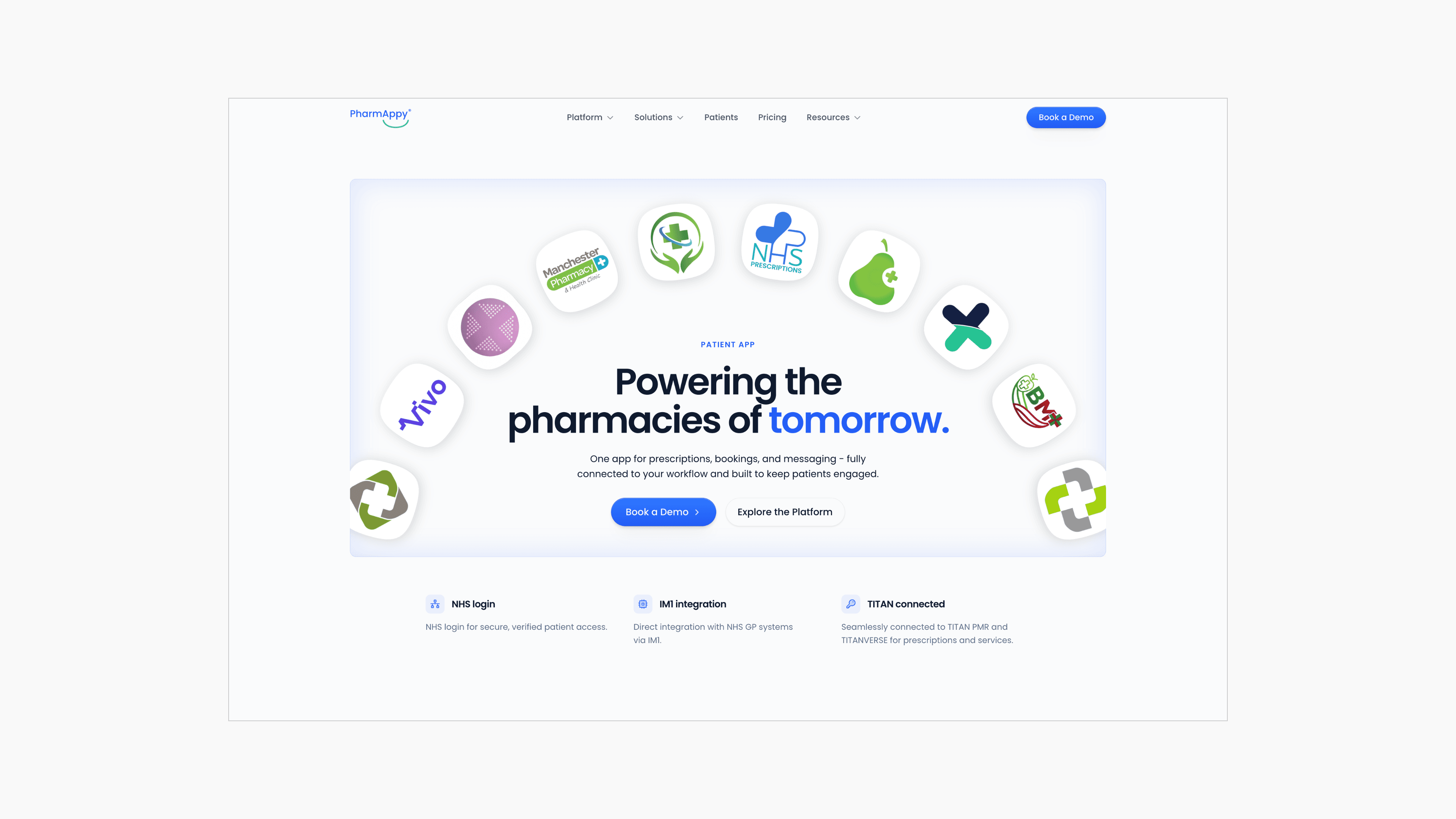
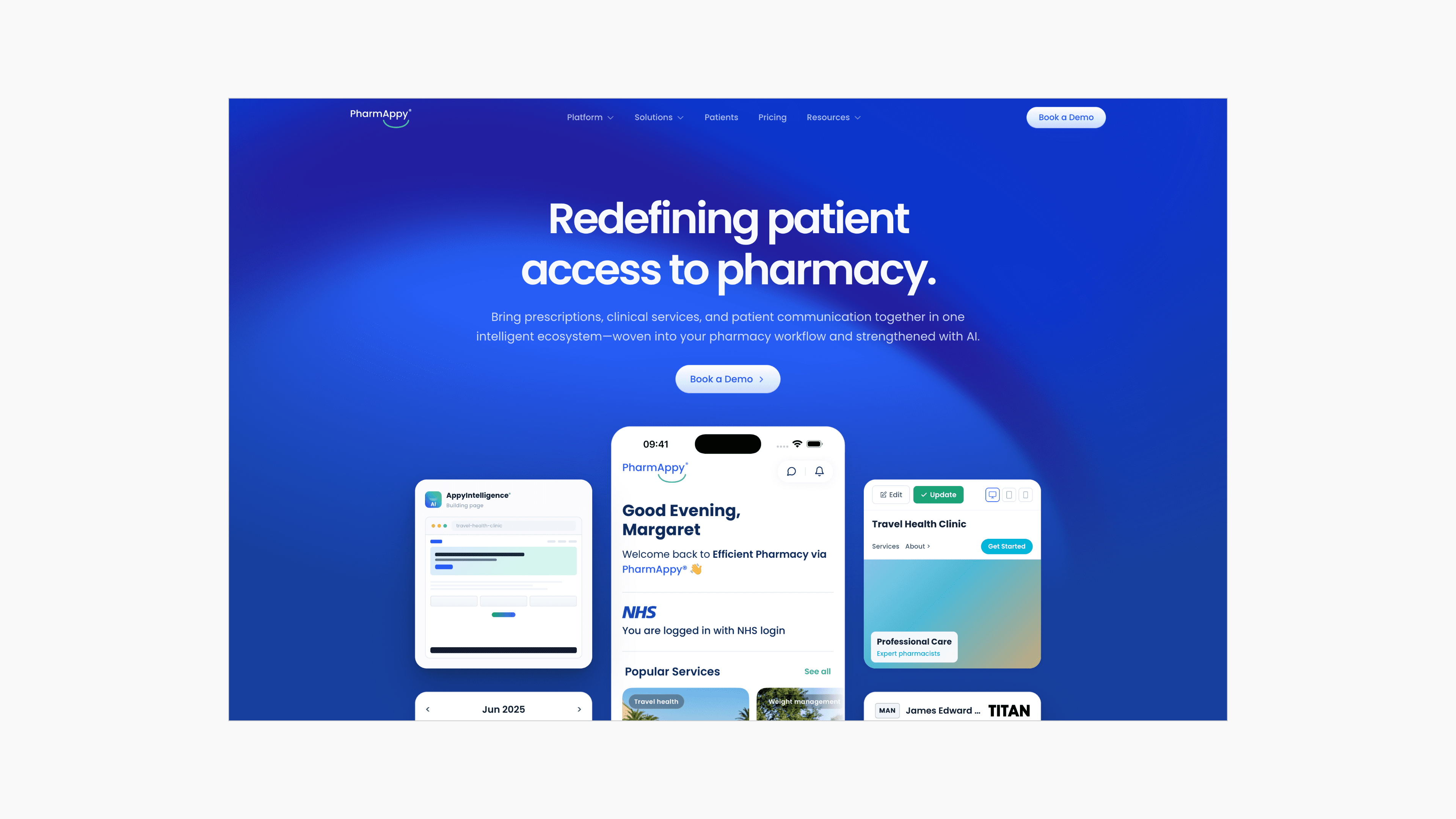
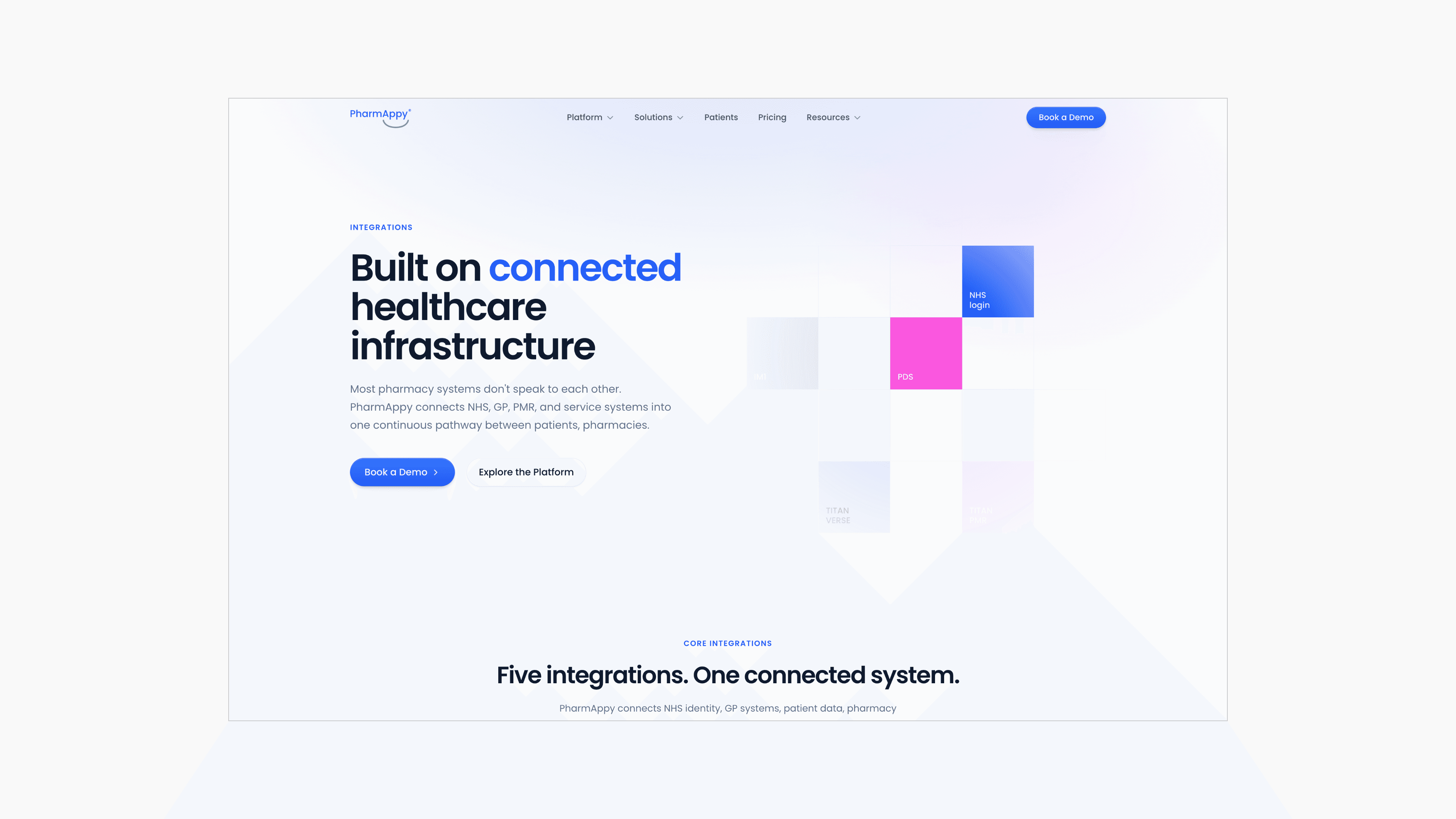
The homepage shifted from vague platform speak to concrete outcomes pharmacists could evaluate in seconds.
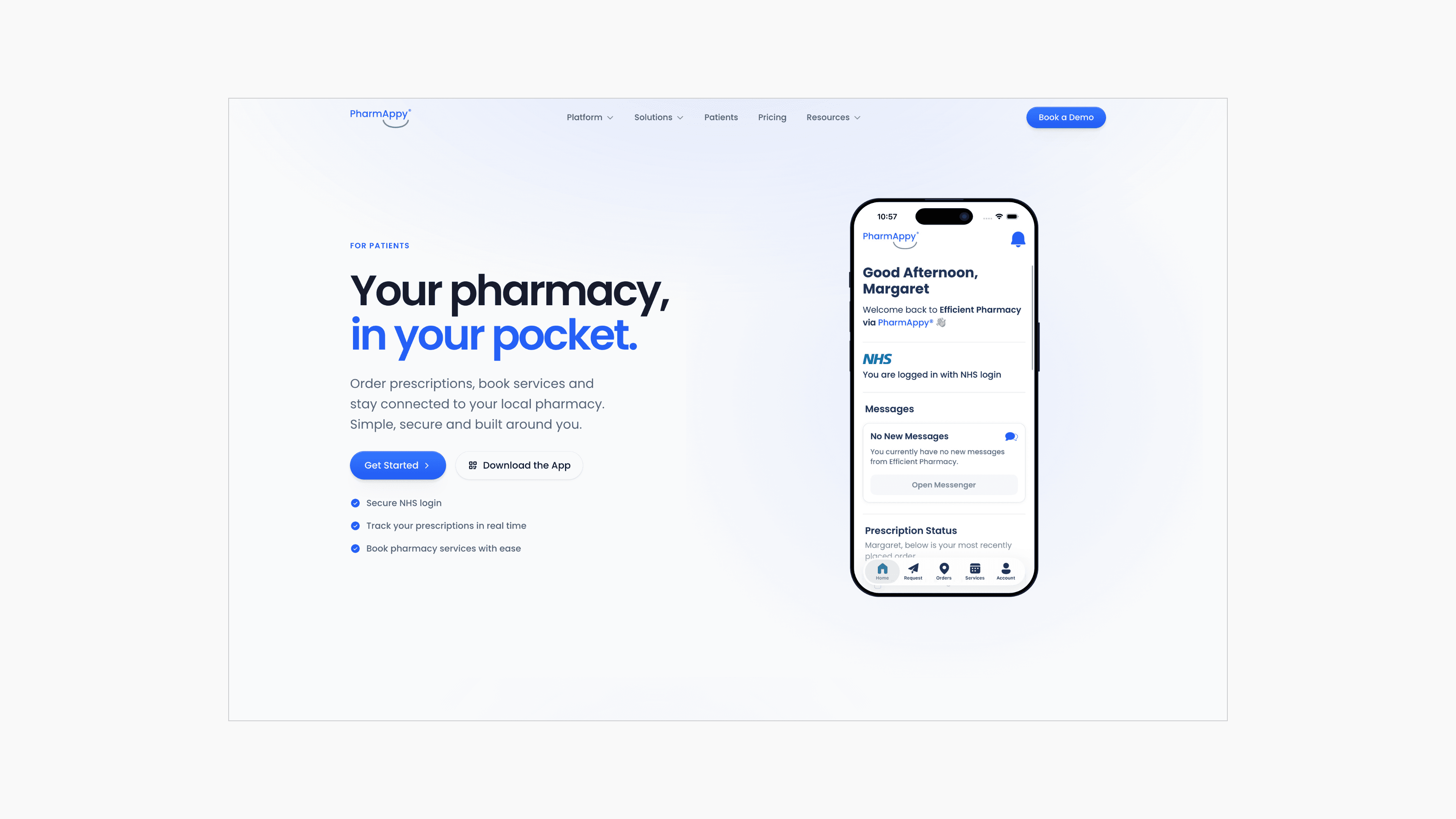
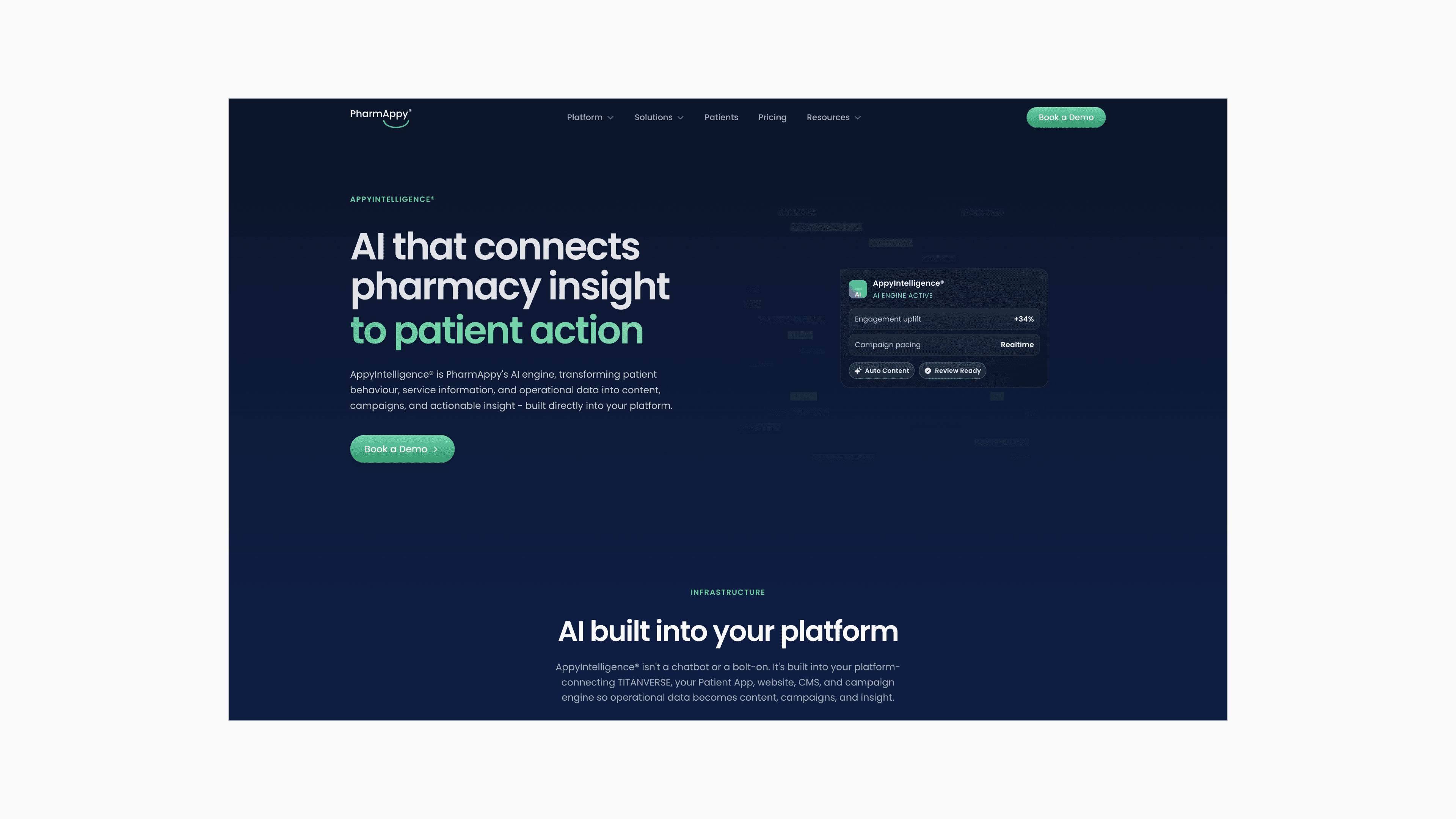
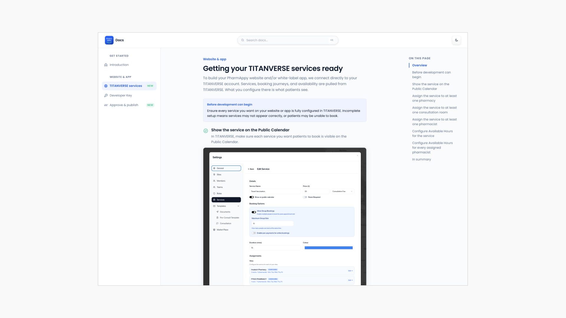
Customer documentation lives on a separate domain, linked from the main website — giving pharmacies a guided help centre without bloating the marketing site.
Design System
To support the work across PharmAppy's products, I built the design system from the ground up — authored primarily in code to serve as a shared single source of truth for developers and our agentic tools. By anchoring tokens and components directly in code rather than static design artifacts, we eliminated handoff friction and ensured consistent execution across marketing, product surfaces, and internal tooling.
PharmAppy Design
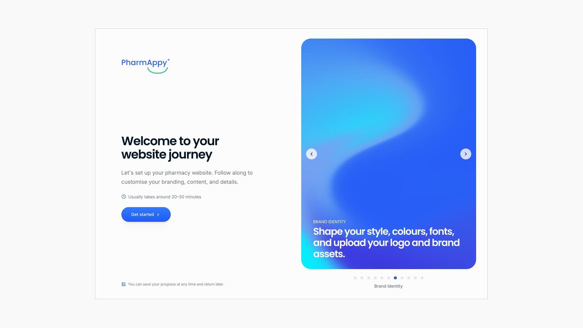
A premium, thoughtful onboarding and support experience for pharmacy customers — designed and built 0→1 as the sole designer on the project. The focus was making a process that's typically technical and intimidating feel guided and reassuring instead, so customers feel supported rather than left to figure it out alone.
Key Decisions
Company Website
What to include in the hero
Balancing clear core value messaging with NHS integration credibility to build trust quickly.
Which pages to ship at launch vs defer
Ruthlessly scoping the launch checklist to ship value fast without content bloat.
PharmAppy Design (Website Studio)
ODS verified identity build flow
Transitioning from self-serve to invitation-gated setup, ensuring every site is tied to a verified NHS ODS code to prevent orphaned accounts.
Internal Portal
Built 0→1, consolidated 3+ tools into one system
Eliminated redundant subscriptions by replacing a stack of off-the-shelf tools with a single internal portal built around how the team actually worked.
Web App
Mobile-to-web layout translation
Translating mobile views to desktop via modular two-column and centered layouts that eliminate dead space.
Learnings & Reflections
- Owning design through deployment removed handoff friction, but forced ruthless scope and sequencing to keep shipping fast.
- A shared design system paid for itself as more surfaces needed building and more team members joined — consistency stopped being a debate.
- Consolidating tools was as much change-management as design; adoption only stuck once the single system was genuinely faster than the old patchwork.
Confidentiality note